

So, you have a website—or you want one—and you’d like it to actually work.
It should look good, appealing and capture the user’s attention to create interest and further engagement. Over the years, I’ve seen plenty of projects that should have been great in terms of design but flopped, while simple and seemingly uninspiring sites (looking at you, Amazon) dominate the market.
So, what’s the deal?
As an interesting turn of event, success has less to do with the latest trends and fancy tricks—and a lot more to do with not frustrating your users.
Here are three general things that differentiate amazing web resources from ones that give people migraines:
Homepage layouts that work
Why sliders are your enemy
The impact of text alignment on user experience
Prepare for some harsh realities and incisive facts that will definitely come in handy if you’re trying to push your site to the top of the search results for all the right reasons.
Your Homepage: The Make-or-Break First Date
Just imagine this case: someone lands on your homepage. On average, a user visits your site for about 10 seconds in order to determine why he or she should waste time on it according to NNG. But what is the best approach in web site design to the homepage? It is not about adding in all bells and whistles—it is about minimalism is the way to go especially for the real-world business.
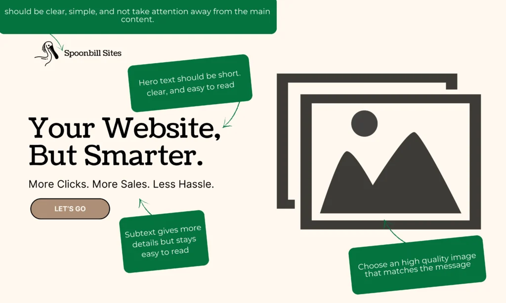
What Works
There are three important things that any homepage should convey at first glance, without even scrolling down the page.
- Who are you? Slap your logo up top. Name it well, and provide name icons that are easy to grasp without any guesswork involved.
- What do you do? Say it fast. If I want a plumber, do not tell me you will repair pipes, not that you bake cake.
- How can you help me? Add a little why you’re awesome vibe—like, “We fix leaks in 24 hours flat.” Boom, I’m hooked.
After that, indicate a plan or a guide to be followed by the visitors. These key items can be three services with a ‘Learn More’ button or four products and these products can lead to the shop.. HubSpot backs this up: a good homepage guides users to where you want them to go without making their brain hurt. In a way, it is similar to having a tour guide, not a labyrinth.
What Sucks
Here’s where folks mess up:
- I go to a Web site, and suddenly there is only one large slide? I acknowledge the fact that to some extent I am nearsighted, I am only able to focus on things that are in the first screen. I can’t see squat beyond that first screen.Take a look at www.nexbank.com; I think it has a pretty interface, but I got rather confused while using it..
- Not enough info: If that all I see is a picture of a logo and the tagline, I am out of there. Tell me what you’re about!
- Sliders: Oh, we’ll get to these disasters next, but here’s a spoiler—they hide your best stuff.
Amazon and Wikipedia? Ugly ducklings that win because they’re easy to use. You don’t need an Awwwards trophy (those are decoration to some narcissistic egos)—you need a home page that works.
Sliders: The Ghost Towns You Should Burn Down
Okay, sliders. You know ‘em—those fancy carousels sliding across your screen like a PowerPoint on steroids. They’re everywhere, especially on WordPress sites, ‘cause plugins like Slider Revolution make ‘em a breeze to add. And to tell you the truth, ((sliders)) do not work. They’re ghost towns in that, for all intents and purposes, it feels as though you are interacting with empty towns, and I am begging you to stop using them. Let’s break it down.
Why People Love ‘Em (Spoiler: They’re Wrong)
- They look cool: Fair. A slick slider can feel modern and “clean” (barf, I hate that word).
- Space-saving: Scared of scrolling? Sliders cram content into one spot. Ironic, they scroll, just in a horizontal direction.
Why They’re Trash
The realities, though, revealed in various researches show that no one actually clicks them.
- In an experiment carried at Notre Dame, the first slide was clicked 84% of the time, the other slides only 4% each. According to the heat maps demonstrated by Conversionista when it comes to static images 40% of them are clicked while only 2% of sliders are. Ouch.
- Some elements of Web usability dissected: the struggle to properly design sliders because we ignore elements that resemble advertising banners. Your big announcement? Ignored.
- The things that move kill autoplay, As pointed out, motion steals control. It’s so different from what I can read—the material for 8th deadly sin.
- Speed killer: The verdict: Using Slider Revolution brought a degradation of the Google speed score to my tests by 10, adding 1.7 seconds Smart Slider 3? Up to 20 points on mobile. Smashing Magazine also goes in line with this cryptic idea, stating that sliders impede your performance.
Blair Keen ditched a slider and saw sales jump 23%. Convinced yet? Avoid these strictly speaking and use a grid or a set of static images instead.

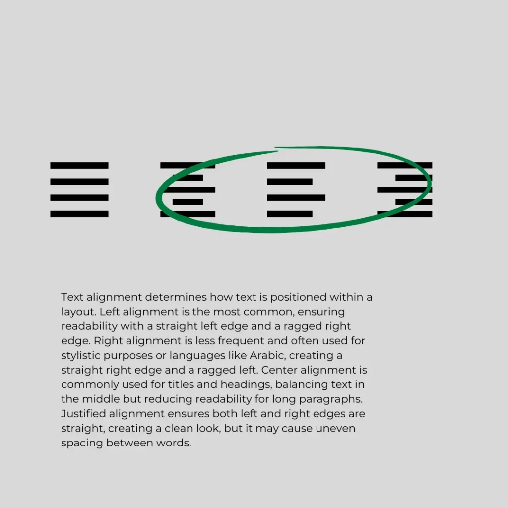
Text Alignment: Stop Making Me Squint
Last up: text alignment UX. I have come across it—centered paragraphs, justified blocks, right-aligned rants—all for the sake of making it look good. But here’s the deal: it is screwing your readers. That’s why it’s high time to decide what needs to be improved and what should be left behind.
The Four Horsemen of Alignment
- Left: The GOAT. Default, readable, how our eyes roll (in the West, anyway).
- Center: Captivating for titles or brief descriptions; a nightmare otherwise.
- Right: Rare, rebellious, okay for tiny bits like nav CTAs.
- Justified: Fancy in books, but a spacing nightmare online.
Why Left Wins
NNG’s research: The alignment to the left maintains the beginning of lines in check so the eyes don’t go for a hide and seek. It is fast, could be easily recognizable by users, and would not raise haters among the target audience.
The Trouble Makers
- Centered paragraphs: By the third line, I am frustrated, which is why WebAIM says it negatively impacts the accessibility of a site, disorienting those with visual impairments. Titles? Fine. Big blocks? Nope.
- Right: Other than using it as the text of a three-word nav button, don’t bother. Reading right-to-left feels alien—keep it under five words if you dare (Smashing Magazine’s).
- Justified: Looks sharp in books ‘cause editors tweak it. On your site? Narrow columns or long words = gaping word gaps. WebAIM says screen readers choke on it too. Stick to print.
Quick Rules
- Left-align 95% of your text—paragraphs, subheads, everything.
- Center titles or short CTAs (three lines max).
- Right-align nav or tiny flair (three words tops).
- Justified? Only if you’ve got 10+ words per line and a prayer.
Wrap-Up: Build a Site People Love
So, here’s your cheat sheet, pal:
- Make your homepage a no-brainer—answer who, what, how, and guide me around.
- Leave aside the sliders, they are clumsy, neglected and cumbersome. Static wins every time.
- It is better to write in left-aligned text; do not force the reader to strain to decipher your brilliance.
You’re not here to win web design awards. You’re here to keep users happy and clicking.
Questions? Hit us up—we are Spoonbill Sites, and we will rescue you.
")


")